Talking Big Ideas.
“I’m not a cat.”
~ Cat speaking during virtual court for the 394th district of Texas
Maryrose and I spent most of 2020 boondocking around the Rocky Mountains.
After the pandemic hit, we left our home in Virginia and headed west. Our company went remote. Along with the rest of the world, we did our best to quickly get up to speed on living in a locked-down world.
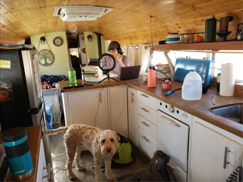
One Monday morning Maryrose took this picture:

I love how it captures the moment.
From my audience’s perspective, I appear professional: the ring light brightens my face, the headphones ensure quality audio, the tablet stacked on books frames my face well, and I’m angled so my background provides depth without distraction.
The rest of the picture tells a different story.
I’m in a bus. Cables run everywhere. Climbing gear is strewn about. Clothes and blankets are piled on the couch. The countertop is cluttered. Our dog wonders what the hell is going on.
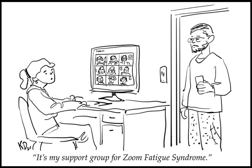
Science advocate Gretchen Goldman’s viral tweet is even better:

This dichotomy may be familiar. Whether it’s pairing a dress shirt with sweatpants or sitting a kid in front of an iPad seconds before logging into a virtual meeting room. We’ve all been there.
While spring is here and the world is finally opening up, many of our meetings and presentations will continue online. So let’s review a few best practices for communicating in the digital world.
There are three issues I still see often: awkward framing, cluttered background, and shadow face. All are easily fixable.
1. AWKWARD FRAMING
Your frame is what other people see. Keep in mind: distance and height.
Distance: Stay inside the Goldilocks Zone where your audience can see your entire head and the top of your shoulders. Too far away and you’ll seem small and disconnected. Too close and you’ll be large and awkward.
Height: Place your camera at eye level. We typically put our laptop on a table and look down at our camera. This is fine for casual chatting, but for presentations be sure to level your camera. You can stack books or boxes to create the right effect.
Your eyes should always be in the top half of your screen. Ideally about two-thirds of the way up. When your eyes are in the bottom half of your frame, your perceived status is diminished.
Consider the feeling you get from this:

Versus this:

Goal: Fill your frame so you are the center of attention.
2. CLUTTERED BACKGROUND
Video meetings allow your audience an opportunity to snoop inside your home. Give your best impression by making sure your background is tidy and authentic.
With our background, we can create a 3D atmosphere in a 2D space. A completely blank wall gives the impression that you’re floating in space. A cluttered background is no better. Again, find the Goldilocks Zone between these extremes.
Bookshelves are a popular pickfor a neat and aesthetic background. Plants, art, or just a clean room also create a professional presence. Kids and pets spontaneously popping into the background (or foreground) might feel embarrassing, but in a casual meeting will likely add smiles. Just read the room.
Goal: Remove clutter. Provide depth without distraction.
3. SHADOW FACE
Bad lighting is the most common problem I see.
Natural light in front of you is best. Of course, we can’t move our windows, or the sun, to meet our preferences. The perfect set-up in the morning could become a backlit disaster in the afternoon.
Make sure your audience can always see your eyes. Avoid shadows, sharp lighting, and the spotlight interrogation room effect. Bright light from behind is the worst as it casts a dark shadow over our faces. Sharp light from above, below, and the side may also be distracting.
A ring light is well worth the investment, and you can get one for under $20 on Amazon. A combination of natural and artificial lighting will give you flexibility.
Goal: Have bright eyes with soft, even light across your face.
*****
Communication is about connection. Whether it’s face-to-face or virtual, avoid distracting your audience.
***
![]() IDEA
IDEA
Create a virtual presence that connects, not distracts.
Take one minute to look at your workstation. How can you apply one of these principles?
Try elevating your camera, decluttering your background, or moving a lamp. This doesn’t have to be your full-time set-up, but know in advance what you can quickly adjust to improve your online presence.
***
If you find this useful, please subscribe to our free weekly newsletter.


