
One Idea. One Challenge. Once a Week.
“Bullets belong in The Godfather. Avoid them at all costs.”
~ Chris Anderson
Ted Hustead wanted to get away from it all.
In 1931, he packed his belongings and moved with his wife, Dorothy, and their young son to “the middle of nowhere” in rural South Dakota. A pharmacist eager to make a living helping his new neighbors, he bought a small drug store in a 300-person town named Wall. His father-in-law called it “just about as Godforsaken as you can get.”
The cold air was vicious and drought had already wiped out the local farmers. Business at the store was slow. Ted and Dorothy agreed to give Wall five years. And by 1936, steeped in the Great Depression, they were still struggling to make ends meet.
Laying in bed one hot summer night, Dorothy listened to the cars driving along a nearby highway. People were coming from all over to see a new attraction called Mount Rushmore. She turned to Ted and said:
What is it that those travelers really want after driving across that hot prairie? They’re thirsty. They want water. Ice cold water! Now we’ve got plenty of ice and water. Why don’t we put up signs on the highway telling people to come here for free ice water?
Ted agreed to give it a shot. Dorothy wanted the signs to be simple. One short slogan per sign. And several signs in succession that would guide the tourists to them:
Free ice water! ~ Get a soda ~ Turn next corner ~ Wall Drug
Business took off. That summer they had to hire eight extra employees to keep up. They kept adding more signs.
Nine decades later, Wall Drug employs 200 people and serves more than two million customers a year. Their billboards are a staple across Rocky Mountain highways, spanning more than 650 miles around the town of Wall.
Always one simple idea per sign.
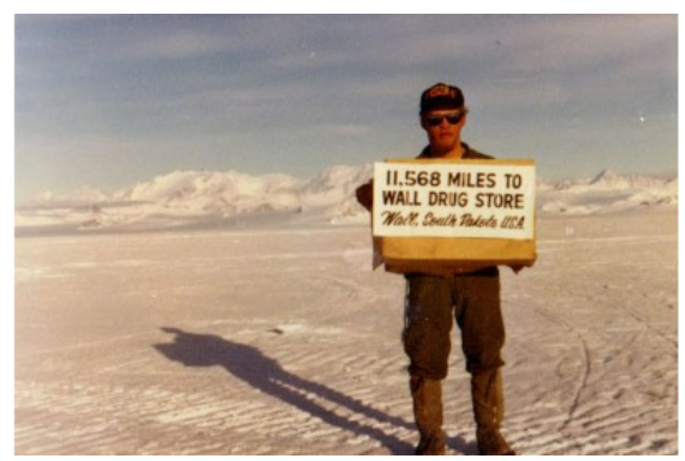
They’re so iconic that customers make their own versions during travels to the farthest reaches of the planet:
Imagine if Dorothy took a different approach with her signs. Instead of one simple idea, what if she packed as much content as possible onto them?
What if the first Wall Drug billboards looked like this:

How many travelers would have read even halfway through that sign? Would the store have survived another five years, let alone be a global tourist attraction today?
Dorothy knew her signs must be clear and compelling. And they needed to make one simple point. It’s the highway billboard test: A quick glance and a passerby will absorb the content.
Today, everyone understands this – when it comes to billboards. And yet, when we make our own signs, notably digital signs, we often violate this common sense.
Think about the last conference you attended. How many of the speakers used slides not like Dorothy’s brilliant billboards, but like the mind-numbing yellow sign above?
As soon as a presenter shows a slide filled with text and bullet points, they force their audience to make a decision: Pay attention to the speaker or pay attention to the slides. (Or perhaps most likely, stop paying attention altogether.)
John Medina, a molecular biologist who studies human brain development at the University of Washington School of Medicine, says that the science on this is clear. He writes:
To put it bluntly, research shows that we can’t multitask. We are biologically incapable of processing attention-rich inputs simultaneously.
Slides filled with text and bullet points don’t compliment a presentation, they create a competing presentation.
Chris Anderson, Head of the TED conference, has a ritual whenever speakers show up with text-heavy slides: “we pour them a drink, go and sit them at a computer monitor, and gently ask their permission to delete, delete, delete.”
At TED, bullet points each get their own slide. Then, multiple phrases are condensed into single phrases. Finally, single phrases are replaced with images. Or cut altogether.
Visuals compliment. Bullets compete.
In general, the average presentation slide is filled with 40 words. And academic slides often have more. But the most compelling speeches you’ve seen, how many words did the presenter put on their slides?
Consider Brené Brown’s talk The Power of Vulnerability. At 57 million views, it’s among the most popular speeches of the past decade.
Notice how she takes her time to get to her first slide. And that it presents one clear idea. The next slide is a simple visual complimenting her speech. It takes Brown 25 slides to reach 40 words total. As a result, her slides seamlessly amplify her voice.
The explorer Robert Ballard gave an exciting talk with 57 slides – and a total of zero words!
Research by Dr. Richard Mayer at UC Santa Barbara shows that we learn better when we use multiple senses. Imagine eating an orange. You get to see it, touch it, and smell it before you taste it. With four senses involved, you’ll tend to remember the orange better than if you only got to see it.
Similarly, when someone shares a story and includes a picture that visually connects us to the story, we remember it better.
Author Carmine Gallo writes, “when the brain is allowed to build two mental representations of an explanation – a verbal model and a visual model – the mental connections are not just a little stronger. They are much, much stronger!”
Again, Wall Drug nails it: free ice water, burgers, homemade donuts, 5 cent coffee, and western wear. Still one idea per billboard. But now with a compelling visual to compliment the slogan.
In 2006, former Vice President Al Gore delivered a short talk about the environment. He eschewed text-heavy slides in favor of striking visuals. He left his listeners spellbound. Sir Richard Branson said Gore’s presentation blew him away. Others declared it a turning point in their lives.
Gore expanded his talk into a documentary that won an Academy Award, earned himself a Nobel Peace Prize, and forever changed the narrative surrounding climate change.
To engage and inspire your audience, follow the path of other successful speakers. Ditch the bullet points. Compliment your voice with visuals and simple, clear ideas.
Embrace your inner Dorothy Hustead.
![]() IDEA
IDEA
Good slides pass the highway billboard test.
Consider an upcoming talk or conversation you’ll have. Are there any visuals or short slogans that could help bring your key ideas to life?
Try sketching them out on small sticky notes. Imagine each sticky note will turn into a slide. One idea per note.
If you can’t easily fit a sketch or slogan onto a single sticky note, find a way to simplify.
***
The Institute for Justice is a law firm known for fighting cases in two courts: the court of law and the court of public opinion.
One time the mayor of Pittsburgh, Tom Murphy, tried teaming up with a Chicago developer for a big project that would violate his residents’ property rights. The Institute for Justice fought back, placing billboards throughout Pittsburgh. Here’s one:
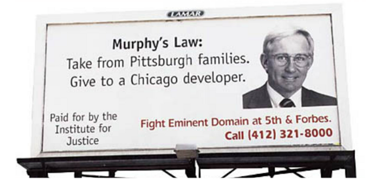
The billboards won awards. They were so successful that the redevelopment project failed before the Institute for Justice filed a lawsuit.
If you find this useful, please subscribe to our free weekly newsletter.